Kidly |
Kidly |
A Better Way To Manage CaregiversKidly is a hybrid(IOS, Android) app that aims to solve issues related to scheduling, tracking, messaging and expenses between nannies and parents. I was in charge for creating interactions and UI for the project.
|
My RoleInteraction Design & PrototypingI started this project by understanding all the use cases provided by the product manager. As, we followed project management methodology for developing Kidly, I created rapid interactions and mockups of the mobile screens.
UI Design & User-TestingI created the UI grids, decided the typography and colors for the UI. I presented multiple UI screen designs to the stakeholders and developed the best solution. I also participated in the usability studies and collected all the necessary data.
On-Going SupportAfter we decided that we have included all the features in the UI, I started supporting the development activities. I streamlined the assets transfer process and coordinate with the developer to implement the designs.
|
The Story |
The Struggle Of A Working ParentOur CEO and his wife are working parents of a three beautiful kids. They hired 3 nannies and 1 baby sitter to manage their kids. Over the years they have used 3-4 applications, notepads, excel sheets to create schedules, messages, moments and expenses. Every week they spend 4-5 hours doing expenses rather than spending with their kids.
Our CEO felt frustrated with the overall experience and found out a need to manage caregivers more efficient. He took this challenge on himself and started working towards creating an application. OpportunitiesWorking at Kidly provided me the best opportunity to work in a team setting. I worked in Agile environment, attended all the usability sessions and saw users playing with my design. This overall experience was very satisfying.
ConstraintsAs I was hired to perform Interaction and UI design, user research was out of my scope. I worked with speculative data and made design decisions based on the use cases. Also, our developer was working from Austin, Texas so sometimes communication and collaboration was a constraint.
|
Problem StatementTo make scheduling, expense tracking, and messaging activites better between Parents and Nannies. |
InteractionRequirements Gathering & BrainstormingI gathered all the information, analyzed all the use cases and divided them into two main categories - Parents and Nannies.
Use Cases CategorizationMy initial categorization was based on the user role - Parent or a Nanny.
|

Affinity DiagrammingAfter careful observations I found out four different use cases categories - Initial screens, activities, social and tracking. I created the app menu according to these categories.
|
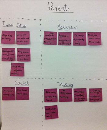
Click Image
|
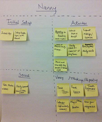
Click Image
|
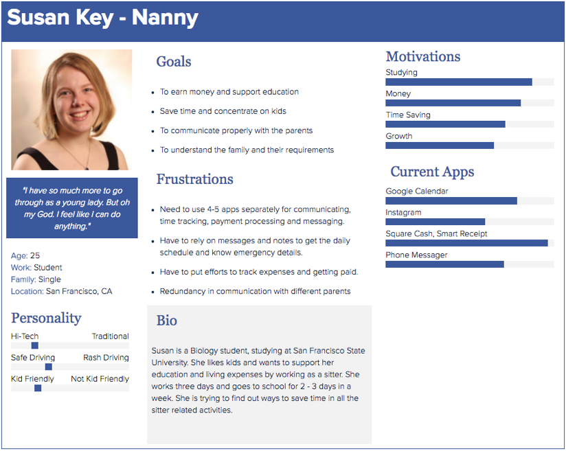
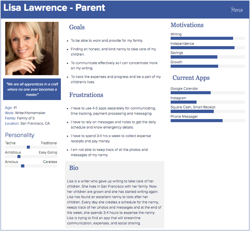
Pseudo PersonasIntroducing Susan & LisaI spoke with a nanny, and a parent and created pseudo personas to start designing. I considered their frustrations and goals for making design decisions.
|
Click Image
|
Click Image
|
Interaction & PrototypingInformation ArchitectureTo link all the use cases together, I created the following Information Architecture. You will find some similarities and differences between a Nanny and a Parent screens.
|

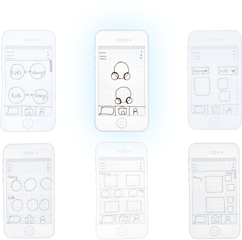
Brainstorming Home Page DesignAfter creating the Information Architecture, I created quick and easy sketches of the home page and presented them to the stakeholders. The second sketch was the one we decided to design.
|
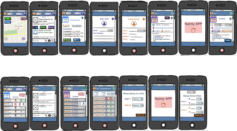
Initial Pencil SketchesI created 40 screen pencil sketches to quickly grasp the overall idea of the app and present it to the stakeholders. They started playing with the application and gave me feedback about the approach. I used that feedback for next iteration.
|

WireframesI developed comprehensive clickable wireframes, capturing initial intent of the design. We presented these wireframes to the users and captured their overall understanding about the app. We recorded the usability sessions and used the feedback given to develop the UI for Kidly.
|
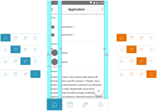
UI DesignGridThe grid for this app is based on the Google Material Design and IOS Design Grid. I captured elements from both the design systems and created a hybrid grid to present our design intent.
|
TypographyWe decided to use Roboto for Android and San Francisco for IOS to show familiarity of the app to the users.
|
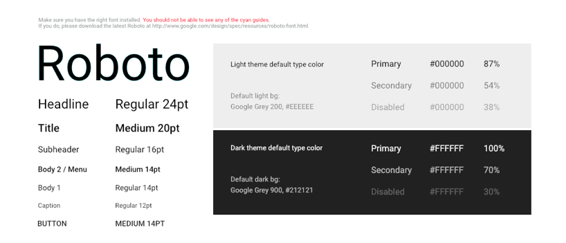
Android Material Design Typography
|
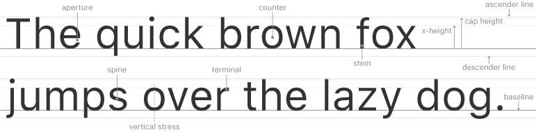
IOS Design Typography - San Francisco Font
|
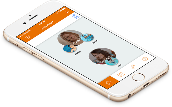
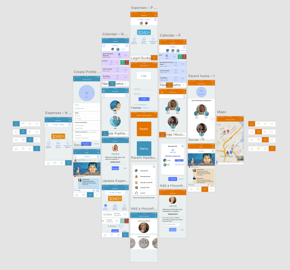
Final DesignBased on all the design elements I created 80+ screens. We did usability testing on these screens and decided to develop them. The orange color represent Parent screens and Blue screens represent Nanny screens.
|
Current StatusNeed More Fuel To Run The ProjectAfter I receive a go for the designs. We implemented 80% of the design. On our way to finish the development. We ran out of funds and our CEO stopped the development for now. As soon as he gets the funding, we will finish the development and launch the application.
|
